A reader recently wrote in asking if I could share a bit about the process of putting the book together and talk about how the project started. Certainly.
I go on two solitary walks every day. There is a small park off the Embarcadero that is tucked away in a quiet spot. It has a pleasant stream flowing through it and an unassuming bench beside that stream. I have made walking to that frail bench a ritual, and the half an hour or so spent daydreaming on it amid the cool San Francisco breeze, an article of faith.
It was on a day in October of last year when, during one of those quiet moments on that bench, I recalled my college years and how outspoken I happened to be during them, an observation only made interesting by the fact that I have since turned into the quietest of beings. They say that achieving knowledge is a function of one's ability to maintain both doubt and hubris. I don't know. I find that as the years go by, I am left with more of the former and less of the latter.
A realization that coincided with that nostalgic whiff was that a sizable amount of the discourse nowadays continues to be plagued with bad reasoning.
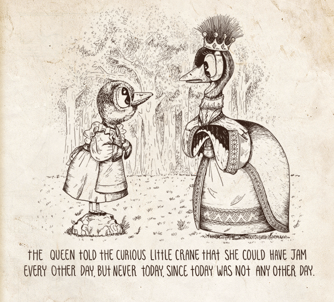
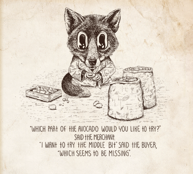
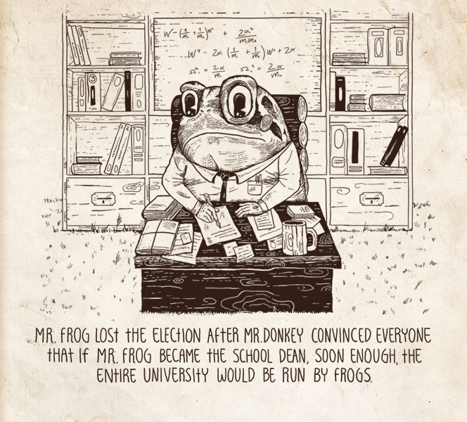
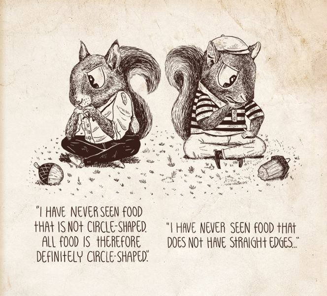
Hence, the idea that finally shook me into soberness was one that had been fermenting for a while. It was that of visualizing, in a simple manner, some of the principles that had helped me do well in debates and in off-the-cuff arguments with colleagues. Simple. That would be the novelty of it. And so, with my two-year old daughter in the back of my mind, I decided that illustration would be an ideal language, given its universal appeal.
Once I had a draft version of the book ready, I sent it to one of my life-long idols, Marvin Minsky, co-founder of the MIT Artificial Intelligence Lab and author of The Society of Mind. I must have spent a good week writing that email. I was overjoyed when he wrote back a few hours later calling the book “beautiful!” It was quite possibly one of the highlights of my life. Having read the email, I made sure to maintain my earnestness while I found a private place, wherein I proceeded to do the Apache dance from Fresh Prince.

The cover is inspired by one of my favorite games growing up: LucasArts' Monkey Island series. The title's typography and the general feel of the whole scene borrow a bit from Monkey Island and a bit from Indiana Jones. The cover's concept is based on the metaphor that good deductive logic is like a watertight pipe where truth goes in and truth comes out. Hence, the cave that the two explorers are peeking through, which you may notice has an opening resembling that of a human ear, is actually the inside of someone's head, and the leaking pipes indicate that this person's head is filled with bad logic.
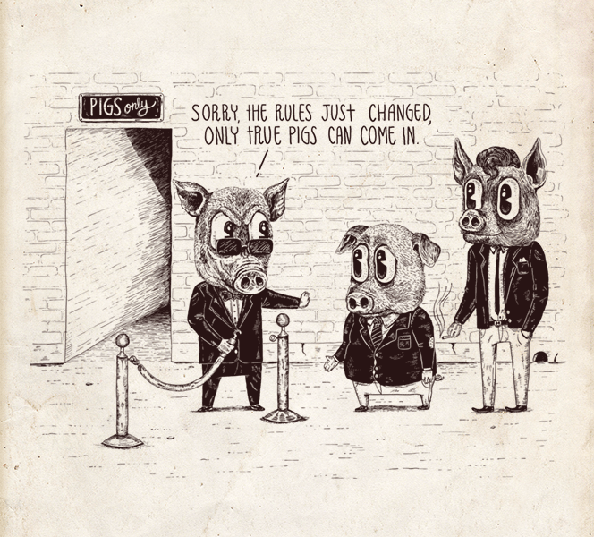
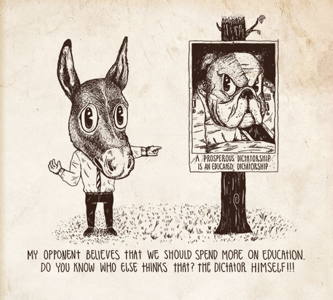
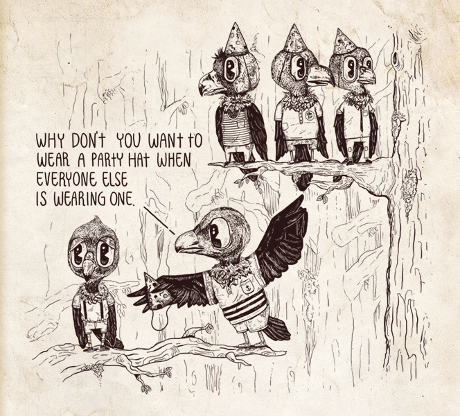
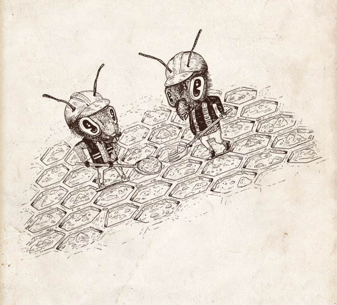
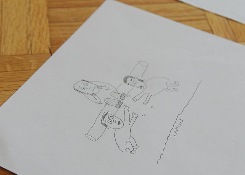
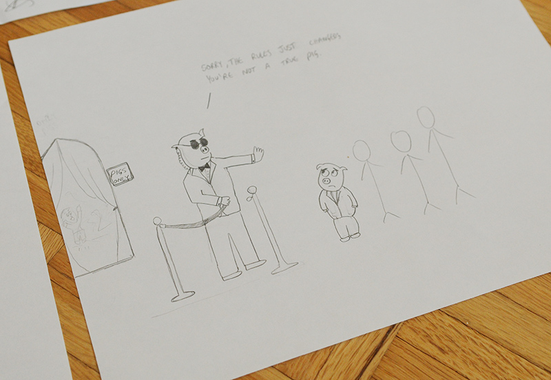
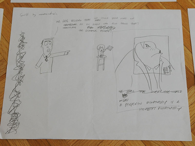
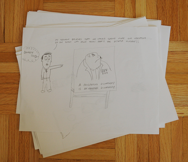
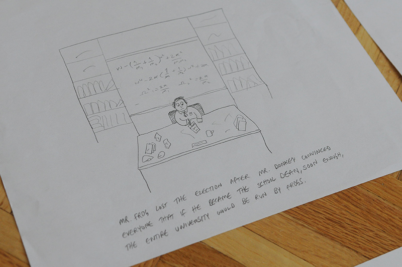
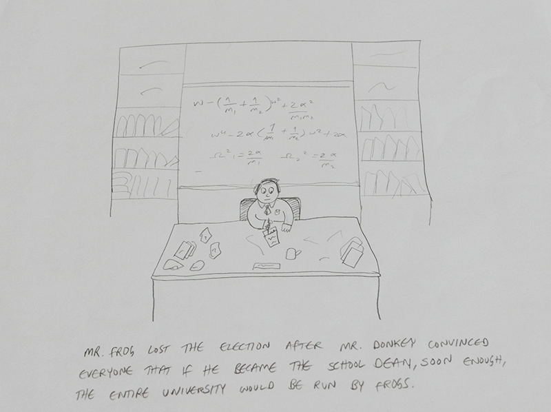
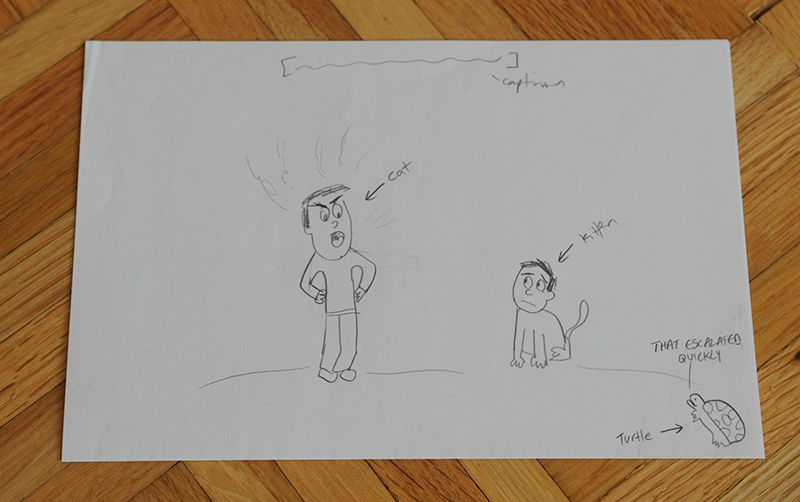
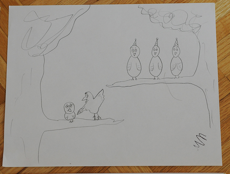
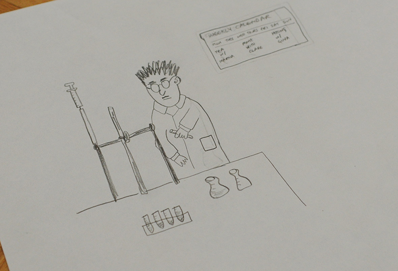
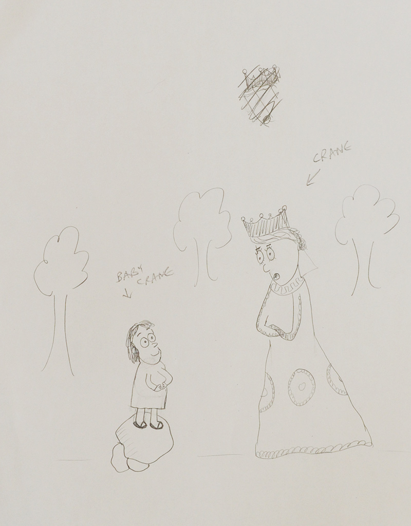
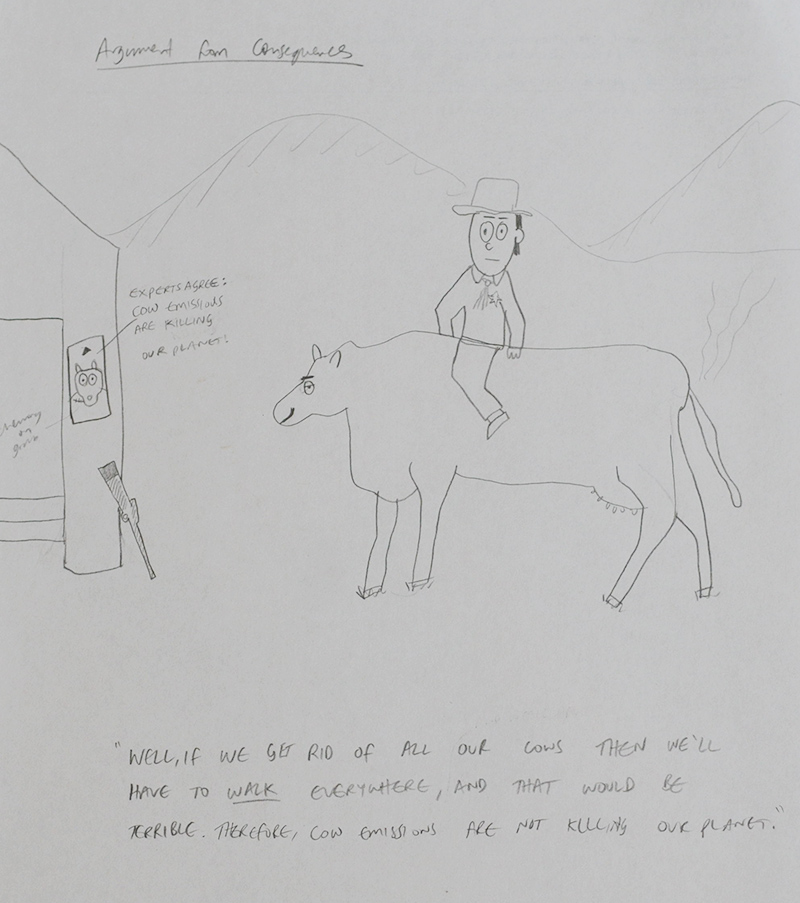
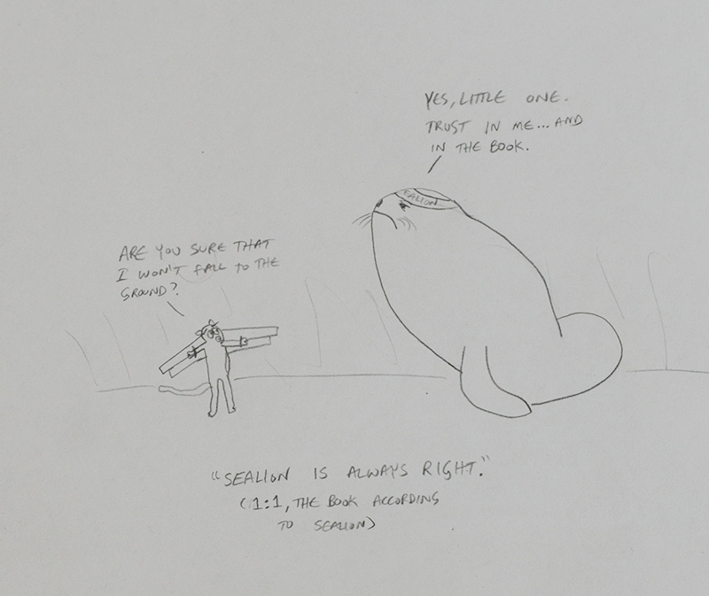
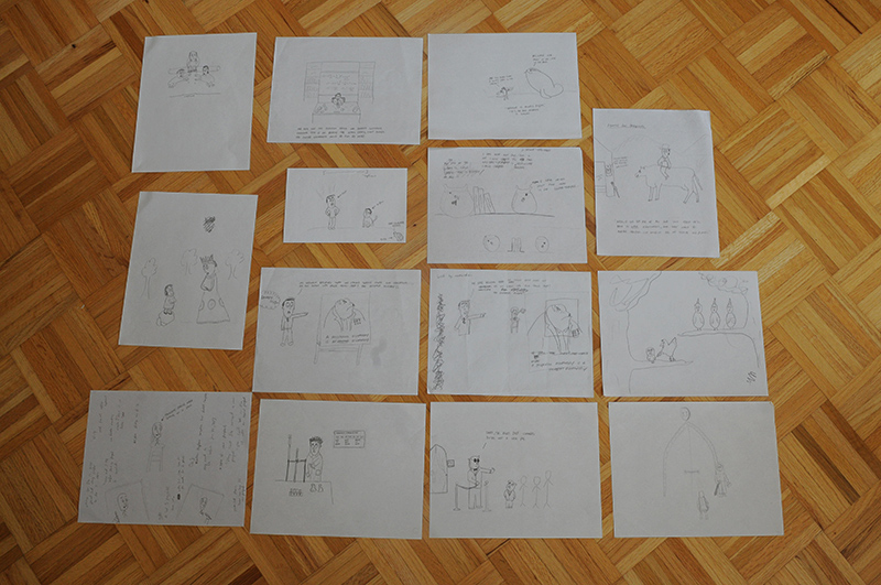
Shown below are some of the original sketches that I came up with. I had the scenarios, characters and captions in mind, and a modest ability to transform them into drawings. What I really wanted though was a woodcut style that would give the work an antiquated feel, because after all, if it looks old, then it must be of value—irony intended. I commissioned a professional illustrator who did a nice job of translating a set of sketches, prose and undocumented ideas into the illustrations you see in this final artifact.
The project is a public service, and although it has cost a fair amount of money, nothing would make me happier than to see it used to teach younger people or those new to the field the importance of logical reasoning. It is meant to serve as a modest, yet hopefully timeless, contribution.
Thank you for visiting and for your emails; they make my day. Enjoy the sketches below. If you don't see them, then they are still being loaded. Look out for the print version on Amazon later this year.
August 20, 2013 · (permalink)


